 BYD Tech
The short answer
A design system is the shared set of styles, reusable components and written rules a team uses to build a product, kept in one place for both designers and developers. It makes screens consistent and faster to build, because nobody redraws a button or reinvents a form. A startup does not need a full one on day one. Start with a small set once the same elements appear on several screens.
Key points
- Three parts: foundations, components, and guidance on how to use them.
- It exists in design files and in code, and the two must match.
- The payoff is consistency, speed and fewer accessibility mistakes.
- Start small. A few well-made components beat a large unused library.
- It needs an owner, or it drifts out of date.
What a design system is
Nielsen Norman Group describes a design system as a set of standards for managing design at scale, made of reusable components and patterns together with the guidance for using them. The practical meaning is simple: a product built from the same parts looks and behaves like one product.
It is more than a style guide. A style guide says what things look like. A design system also provides the working pieces and the rules for combining them.
What goes in one
| Layer | What it holds | Examples |
|---|---|---|
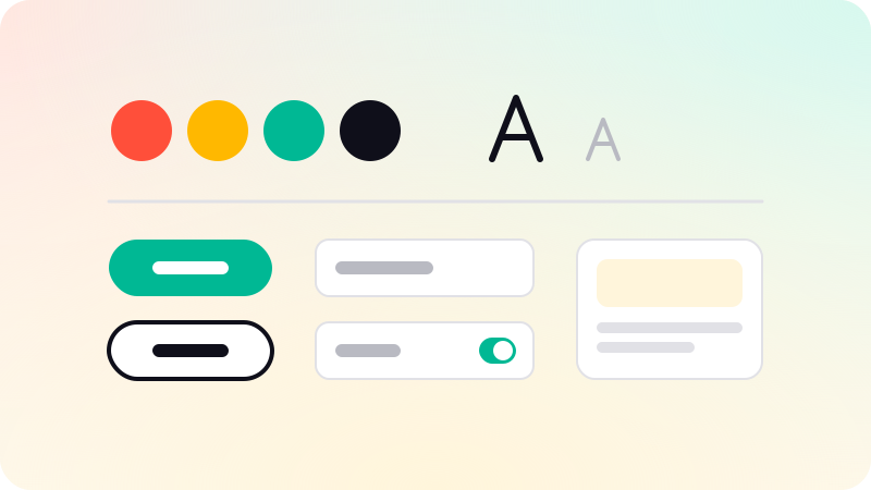
| Foundations | The basic decisions | Colors, type sizes, spacing, icons, as named tokens |
| Components | Reusable building blocks | Buttons, inputs, tables, modals, navigation |
| Patterns | How components combine | A sign-up form, an empty state, an error message |
| Guidance | When and how to use them | Do and do not examples, wording, accessibility notes |
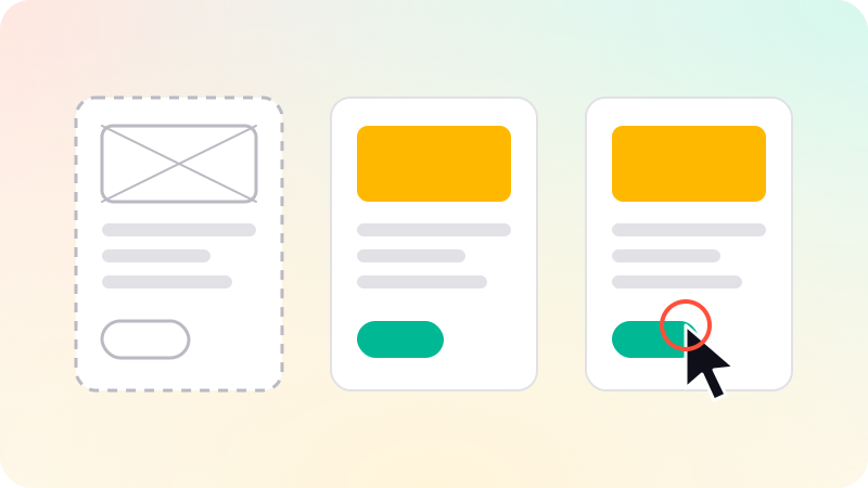
Each component should cover its states, not only its resting look: hover, focus, disabled, loading, error and empty. Missing states are where products start to feel unfinished.
One system, in design and in code
A design system lives in two places: as components in a design tool such as Figma, and as real components in the codebase. If the two drift apart, designers hand over screens that developers cannot build from the existing parts, and the system stops saving time.
Design tokens are how they stay aligned. A token is a named value, such as the primary color or the standard spacing, used by both sides. Change the token and both the designs and the product update.
Why it helps
- Consistency: the same action looks and works the same way everywhere.
- Speed: new screens are assembled from parts that already exist.
- Accessibility: contrast, focus and keyboard behavior are solved once, in the component.
- Fewer decisions: designers and developers stop debating spacing on every screen.
- Easier handover: a new team member can see how things are meant to be built.
When a startup should build one
- Before launch: do not build a system. Pick colors, type and a handful of components, and ship.
- After a few screens repeat the same elements: extract those into shared components.
- When the product has grown feature by feature and looks inconsistent: this is the moment a small system pays back fastest.
- When a second designer or developer joins: write the rules down.
An inconsistent product is also a common finding in a review. See What is a UX audit?. Design systems are part of our UI/UX design work, delivered in your own Figma.
Sources
Checked when this guide was written.