 BYD Tech
The short answer
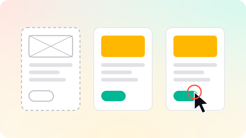
A wireframe is a plain outline of a screen that shows what goes where. A mockup is the same screen with the real visual design: colors, type and images. A prototype links screens together so someone can click through them as if the product existed. They are three stages of the same work, each answering a different question: is the structure right, does it look right, and does it work?
Key points
- Wireframe: structure and priority, in gray boxes. Cheap to change.
- Mockup: the finished look of a screen, not yet interactive.
- Prototype: screens you can click through, for testing the flow.
- Move from rough to refined. Fix structure before polishing looks.
- Not every project needs all three as separate steps.
Side by side
| Wireframe | Mockup | Prototype | |
|---|---|---|---|
| Shows | Layout and content order | Visual design | Behavior and flow |
| Looks like | Gray boxes and labels | A finished screen | A finished screen you can click |
| Question it answers | Is everything in the right place? | Does it look and feel right? | Can people get through it? |
| Cost to change | Very low | Medium | Higher |
| Who it is for | The team | Stakeholders and developers | Test users, investors, developers |
Wireframes: getting the structure right
A wireframe strips a screen down to boxes, lines and labels. With no color or imagery to react to, the conversation stays on the things that are hardest to fix later: what is on the screen, in what order, and what the user does next.
- Draw them quickly, on paper or in a design tool. Speed is the point.
- Use real words where you can. Placeholder text hides problems with length and meaning.
- Expect to throw several away. That is cheaper now than at any later stage.
Mockups: deciding how it looks
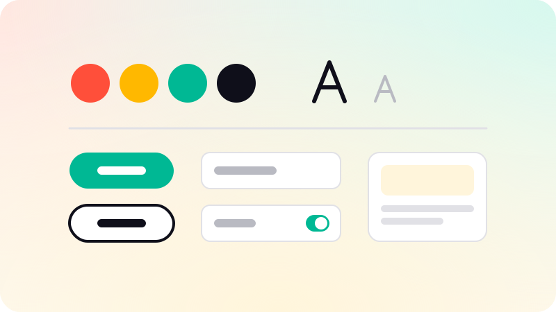
A mockup applies the visual design to the agreed structure: brand colors, typography, spacing, icons and images. It is a static picture of the finished screen, and it is what developers build from.
- Design every state, not only the ideal one: empty, loading, error and first use.
- Check contrast and text size for accessibility at this stage.
- Design for a phone and a desktop width, not one stretched to fit the other.
Repeated elements across mockups are the start of a shared library. See What is a design system?.
Prototypes: testing how it works
A prototype connects screens so that tapping a button leads somewhere. Nothing is saved and no real code runs, but a person can try the main flow on their own phone. Nielsen Norman Group distinguishes low-fidelity prototypes, which can be as simple as linked wireframes, from high-fidelity ones that look like the real product.
- A low-fidelity prototype tests the flow early and cheaply.
- A high-fidelity prototype tests the real experience and is what investors and first users respond to.
- Watching a handful of people use it will show most of the problems.
A prototype is not a product. The difference between it and a first working version is in MVP vs prototype vs proof of concept.
Which do you need?
- A new product: all three, in order. Agree on structure, then looks, then test the flow.
- A small feature in an existing product with a design system: often straight to a prototype built from existing components.
- A pitch to investors: a high-fidelity prototype of the one flow that tells the story.
- An early idea you are still shaping: wireframes only, until the structure settles.
This is the order we follow in UI/UX design: a flow map and gray-box wireframes first, then the visual design, then a clickable prototype you can try on your phone, all in your own Figma.
Sources
Checked when this guide was written.