 BYD Tech
The short answer
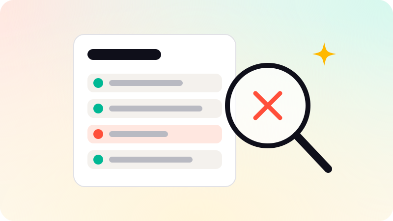
A UX audit is a structured review of an existing product to find where users get stuck and why. A designer goes through the key flows against known usability principles and your own data, then hands back a ranked list of problems with a recommended fix for each. It is worth doing when people sign up but do not finish, or when a product has grown feature by feature and no longer feels like one thing.
Key points
- An audit reviews what exists. It does not redesign the product.
- It combines expert review with your analytics and, ideally, a few user sessions.
- The output is a ranked list: problem, evidence, impact, suggested fix.
- Do one when drop-off is high or before a redesign, not instead of talking to users.
- Fix the top few findings first. Most of the gain is there.
What a UX audit is, and is not
An audit looks at the product you already have and asks one question of each important flow: can a new person get through this without help? It is a diagnosis. It tells you what is wrong and what to do about it, in order of importance.
- It is not a redesign. The result is a list of findings, not a new set of screens.
- It is not user research on its own. It uses evidence about users, but it does not replace talking to them.
- It is not a matter of taste. Each finding should point to a principle, a number or an observed session.
What an audit covers
- Goals. Which flows matter to the business: sign-up, onboarding, the first key action, checkout or upgrade.
- Expert review. A designer walks through those flows against established usability principles, such as Nielsen Norman Group’s ten usability heuristics.
- Data. Analytics show where people actually leave. A funnel report often points straight at the worst screen.
- Sessions. Recordings or a handful of moderated tests show why they leave. Nielsen Norman Group’s guidance is that a few participants reveal most usability problems.
- Accessibility basics. Contrast, keyboard use, labels and focus, checked against the WCAG guidelines.
- Consistency. The same thing called by one name and behaving one way throughout.
What you get at the end
| Part of the report | What it tells you |
|---|---|
| The finding | What the problem is, on which screen |
| The evidence | The principle it breaks, the number, or the session where it happened |
| The impact | How many users it affects and how badly |
| The fix | A specific change, small enough to act on |
| The order | What to do first, second and later |
A good report is short enough to read in one sitting and specific enough that a developer could start on the first item the same day. A long document with no priorities is a sign the audit was not finished.
When you need one
- People sign up and then do not complete the first key action.
- Trial users do not convert, and you cannot say where they give up.
- Support answers the same "how do I" questions every week.
- The product grew one feature at a time and now feels inconsistent.
- You are about to redesign and want to know what to keep.
You probably do not need one before launch. With no users there is nothing to audit, and a clickable prototype tested with a few people will teach you more.
What to do with the findings
Fix the top few and measure again. Most of the improvement usually comes from a small number of problems on the path every user takes: an unclear first screen, a form that asks for too much, an empty state that says nothing. Leave the long tail of small issues for normal product work.
Audits of SaaS onboarding are part of our UI/UX design work. You get what we found, ranked by impact, and what we would change first.
Sources
Checked when this guide was written.