 BYD Tech
The short answer
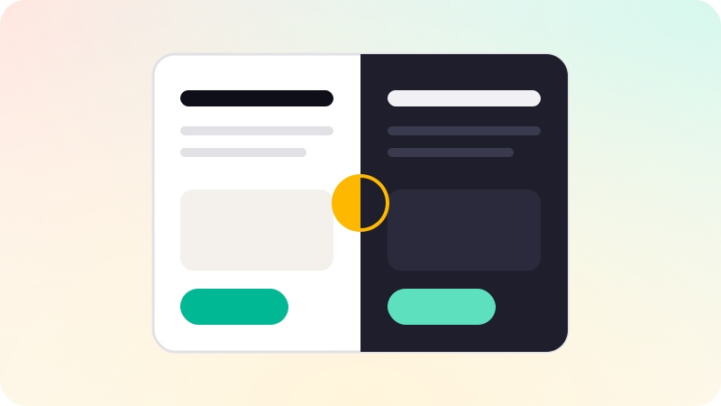
Good dark mode is designed, not inverted. Define colors by their role, such as background, surface, primary text and accent, with a light and a dark value for each, and let the app follow the user’s system setting. Use dark greys and layered surfaces rather than only pure black, soften saturated brand colors, keep text contrast at least 4.5 to 1, and check images, logos and charts in both modes.
Key points
- Define colors by role, each with a light and dark value.
- Follow the system setting by default; offer an override if useful.
- Use layered dark surfaces, not just one black.
- Keep text contrast at 4.5 to 1 or better in both modes.
- Check logos, images, charts and shadows in dark mode.
Design colors by role
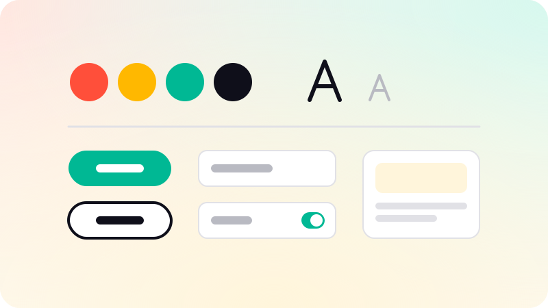
Instead of picking colors per screen, define tokens such as background, surface, text primary, text secondary, border and accent. Each has a light and a dark value. Apple’s semantic system colors and Android’s theme attributes work this way, and Android’s guidance warns against hardcoded colors meant for a light theme.
| Role | Light | Dark |
|---|---|---|
| Background | White or off-white | Very dark grey |
| Raised surface | White with a shadow | A slightly lighter grey |
| Primary text | Near black | Near white |
| Accent | Brand color | A lighter, less saturated version |
Details that make or break it
- Shadows barely show on dark backgrounds; show elevation with lighter surfaces instead.
- Bright, saturated colors vibrate on dark grounds; use lighter tints for text and icons.
- Pure white text on pure black can feel harsh for long reading; soften one or both.
- Logos and illustrations may need a dark version or a container.
- Charts need colors that keep contrast against dark backgrounds.
- Check contrast of every text and control pair against WCAG in both modes.
Building it
- Put colors in design tokens, not in individual screens. See What is a design system?.
- On the web, use CSS custom properties and the prefers-color-scheme media query.
- On iOS, use semantic colors and asset catalog variants. On Android, use a DayNight theme, available since Android 10.
- Follow the system setting by default, and offer light, dark and system options if users ask.
- Avoid a flash of the wrong theme on load by setting the theme before the page paints.
Contrast rules come from WCAG. See What is WCAG? and Mobile app accessibility. Color systems for both modes are part of our UI/UX design work.
Sources
Checked when this guide was written.