 BYD Tech
The short answer
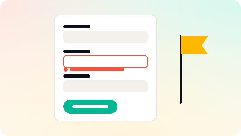
Forms that get finished ask for as little as possible, in a single column, with a visible label above each field. Mark optional fields clearly, or better, remove them. Use the right input types and autocomplete so phones show the right keyboard and browsers can fill details. Validate helpfully: show specific errors next to the field, never by color alone, and keep what the user typed. Each field removed is one less reason to quit.
Key points
- Every field must earn its place.
- One column, labels above fields.
- Labels stay visible; placeholders are not labels.
- Right input types and autocomplete save typing.
- Errors are specific, next to the field, and keep the input.
Ask for less
- List every field and ask what happens if you drop it.
- Ask later for what is not needed now: profile details after sign-up, not during.
- Combine where sensible: one "full name" field instead of three name fields, if you do not need them separately.
- If optional fields remain, mark them as optional rather than marking required ones.
Layout and labels
The Nielsen Norman Group recommends a single column, labels close to their fields, above them on mobile, and grouping related fields. Short related fields, such as city and postal code, can share a row.
- Keep labels visible. Placeholder text disappears when typing starts and is often low contrast.
- Put hints, such as a password rule, under the label before the user types.
- Size fields to the expected answer: a short field for a postal code.
- Make the main button say what it does: "Create account", not "Submit".
Inputs that help
| Field | Help the user with |
|---|---|
| type="email" and autocomplete="email" | |
| Phone | type="tel", accepting any country’s format |
| Address | Autocomplete attributes, or an address lookup |
| One-time code | autocomplete="one-time-code" so phones can fill it |
| Dates | A clear format example, or a date picker for nearby dates |
| Choices | Radio buttons for a few options, a list for many |
Errors and validation
- Check a field when the user leaves it, not on every keystroke.
- Show the error next to the field, in words, with an icon or outline, not color alone.
- Say how to fix it: "Enter a date after today", not "Invalid date".
- Keep everything the user typed, including in other fields.
- On submit, move focus to the first error so keyboard and screen reader users find it.
Good form copy is UX writing. See UX writing and Mobile app accessibility. Forms are designed and tested in our UI/UX design work.
Sources
Checked when this guide was written.