 BYD Tech
The short answer
Design tokens are named values for a product’s design decisions, such as color-text-primary, space-4 or radius-card, stored in one place and used by both design files and code. Changing a token changes it everywhere, so the product stays consistent and themes such as dark mode become a matter of swapping values. The W3C Design Tokens Community Group published the first stable version of a shared token format in October 2025, so tools can exchange them.
Key points
- Tokens name design decisions instead of hard-coding values.
- Base tokens hold raw values; semantic tokens say what they are for.
- Code and design files read the same tokens.
- Themes and dark mode swap token values, not components.
- A shared standard format now exists for exchanging tokens.
Base and semantic tokens
| Layer | Example | Purpose |
|---|---|---|
| Base | teal-600 = #007B67 | The raw palette and scales |
| Semantic | color-action = teal-600 | What a value is for |
| Component (optional) | button-primary-bg = color-action | Fine control per component |
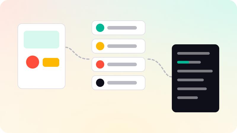
Components should use semantic tokens. Then a rebrand changes which base color color-action points to, and dark mode gives color-text-primary a different value, without touching any component. Material Design 3 layers its tokens in a similar way.
What to turn into tokens
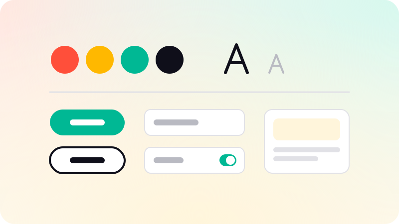
- Colors: backgrounds, surfaces, text, borders, actions, status.
- Typography: font families, sizes, weights, line heights.
- Spacing: a small scale, such as 4, 8, 12, 16, 24, 32.
- Radii, shadows and borders.
- Motion: durations and easing curves.
Setting them up
- Collect the values already in use, and reduce near-duplicates.
- Name semantic tokens by purpose, not appearance: color-danger, not color-red.
- Store tokens in one file in the repository, ideally in the standard JSON format.
- Generate CSS custom properties, and platform files for iOS and Android, from that file.
- Use the same tokens as variables in your design tool.
- Review token changes like code changes.
Tokens are the foundation of a design system. See What is a design system?, Dark mode design and Figma to code. Design systems and tokens are part of our UI/UX design work.
Sources
Checked when this guide was written.